We are fully staffed and not currently hiring.

Edmonton Painters Blog
Beyond Beige: How Colour Psychology Can Completely Change a Room’s Mood
Have you ever walked into a room and immediately felt calm, energized, or even irritated without knowing why? It might not be the furniture or the lighting. More often than not, it is the paint on the walls doing all the talking.
Welcome to the world of colour psychology, the science of how colours affect our emotions, behavior, and overall mood. At Repaint Professionals, we know paint is not just about aesthetics. It is about how you feel when you step into a room.
Whether you want to create a peaceful bedroom, a lively kitchen, or a focused home office, understanding colour psychology can help you make better, more meaningful choices.
Let us explore how the right colours can completely change your space, starting with the mood behind the hues.
Colour Is More Than Decoration
Before we dive into the tones and tints, it is important to recognize that colour is deeply personal. What feels soothing to one person may seem boring to another. Still, research shows that certain colours consistently trigger specific emotional responses.
At Repaint Professionals, we help you translate those emotions into paint choices that serve your lifestyle, personality, and goals. From ceilings to baseboards, we bring more than just skill—we bring purpose.
The Science Behind the Shades
Colour psychology is used in marketing, branding, therapy, and, of course, interior design. The colours you surround yourself with have been proven to affect your heart rate, energy level, and even decision-making ability.
So why not use that science to your advantage when designing your living space?
Let us break down the most common interior paint colours and what they communicate.
What Your Wall Colour Might Be Saying
| Blue 💙 | Calm, relaxed, focused | Bedroom, office | Great for winding down and reducing stress |
| Yellow 💛 | Happy, energetic, welcoming | Kitchen, entryway | Sunshine in a can, but use in moderation |
| Green 💚 | Balanced, refreshing, natural | Bathroom, living room | Feels like a forest escape without the bugs |
| Red ❤️ | Passionate, bold, stimulating | Dining room, accent wall | A little goes a long way, trust us |
| Gray 🩶 | Modern, sophisticated, neutral | Office, hallway | Trendy but calming when paired right |
| Pink 💗 | Playful, romantic, comforting | Nursery, powder room | More versatile than you might think |
| Beige 🤎 | Safe, neutral, predictable | Any room needing subtlety | Time to go beyond beige, perhaps? 😉 |
Blue: The Colour of Peace and Productivity

If serenity is what you seek, blue is your best friend. It lowers blood pressure, encourages focus, and creates a tranquil vibe. Lighter shades like sky blue or powder blue are perfect for bedrooms or meditation spaces. Deeper tones like navy add a sophisticated twist to offices and living rooms.
Pro tip: Avoid deep blues in small rooms with limited natural light, or things might feel colder than cozy.
Yellow: The Energy Booster
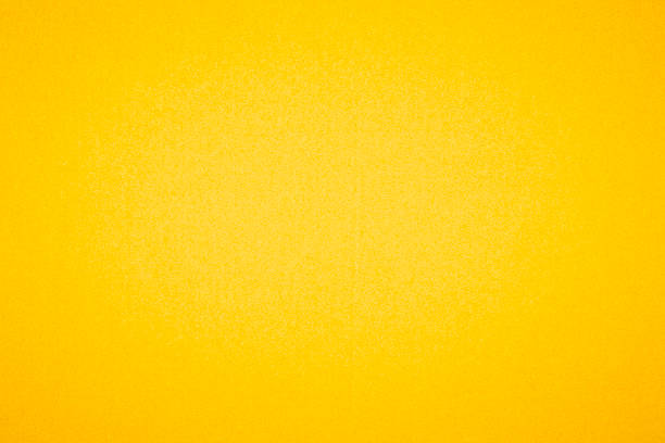
Yellow is the MVP of mood-boosting colours. It sparks energy, optimism, and warmth. That makes it ideal for kitchens, breakfast nooks, or anywhere you start your day.
However, too much yellow can overstimulate and even cause anxiety if used wall to wall. Stick to warm or buttery tones to strike the right balance.
Green: The Great Equalizer
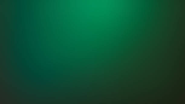
Green bridges the emotional space between blue and yellow. It is both calming and uplifting, making it one of the most flexible choices for home interiors. It also symbolizes growth, nature, and renewal.
Soft sage tones are popular in bathrooms and bedrooms, while deep emerald works wonders in living rooms and studies.
Red: Use With Care
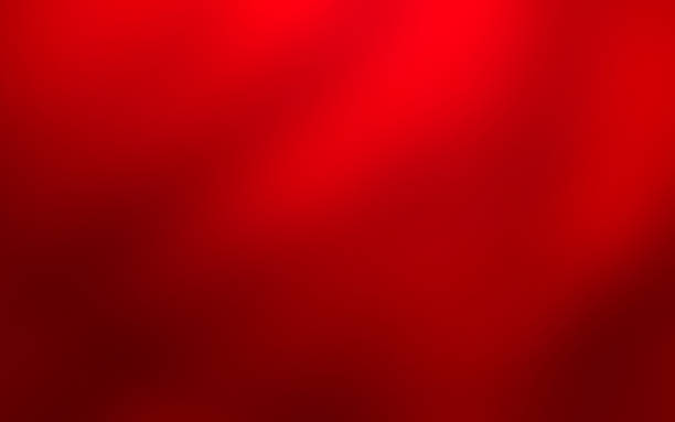
Red is powerful, intense, and full of emotion. It raises energy levels and encourages conversation. That is why you often see it in dining areas or entertainment spaces.
But because red also increases heart rate, it can quickly become overwhelming. We suggest using it as an accent wall or in smaller rooms like powder rooms.
Gray and Neutrals: Elegant or Empty?

Gray has surged in popularity in recent years, and for good reason. It is modern, flexible, and matches almost anything. However, too much gray can feel cold or uninspiring without accents or texture.
Our team at Repaint Professionals often pairs gray with bold trim or vibrant artwork to add life back into the room.
Pink: Not Just for Princesses
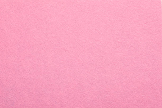
Pink is not just a nursery colour. From warm blush to dusty rose, modern pinks can make spaces feel romantic, cozy, and stylish. Pink pairs beautifully with warm metals like gold or brass and works well in unexpected places like powder rooms or reading nooks.
Beige: The Safe Zone
 Let us face it, beige has been the go-to wall colour for decades. While it does have a calming neutrality, it rarely inspires. That is not
to say beige should be eliminated, but rather, enhanced.
Let us face it, beige has been the go-to wall colour for decades. While it does have a calming neutrality, it rarely inspires. That is not
to say beige should be eliminated, but rather, enhanced.
If you love beige, consider layering it with pops of bolder colour, textured fabrics, or colored trim to prevent your space from looking bland.
Let Colour Serve a Purpose
Paint should do more than cover a wall. It should serve a function. Are you creating a productive space for work? A soothing retreat after a long day? A vibrant family room full of energy and life?
When colour is chosen with intention, the entire room feels different. Not just visually, but emotionally.
At Repaint Professionals, we help you define your goal, then build a palette to support it. No random swatches. No guesswork.
Why Homeowners Choose Repaint Professionals
Our clients do not just want pretty colours. They want a paint job that lasts, feels purposeful, and brings their home to life.
We stand by every brushstroke with:
- Expert surface preparation
- Premium, low-VOC products that protect your air quality
- Meticulous attention to detail
- A strong commitment to communication and transparency
Our team is guided by integrity, honesty, and professionalism. We believe painting is not just a task, but a transformation.
Let’s Paint With Feeling
Colour is emotional. Colour is powerful. And the right choice can uplift your entire home. Whether you are preparing to sell, moving into a new place, or simply craving change, paint is the quickest and most affordable way to shift your space and your mindset.
At Repaint Professionals, we are ready to help you move beyond beige and into a world of expressive, mood-enhancing, personality-filled colour.
📞 Call us at 780-722-1067
🖌️ Or request your free estimate here: https://www.repaintprofessionals.com/contact-us
Let us help you paint with purpose and a splash of personality.
Would you like a matching colour palette guide or interactive room inspiration tool to pair with this blog? I can create that next!